Book Design
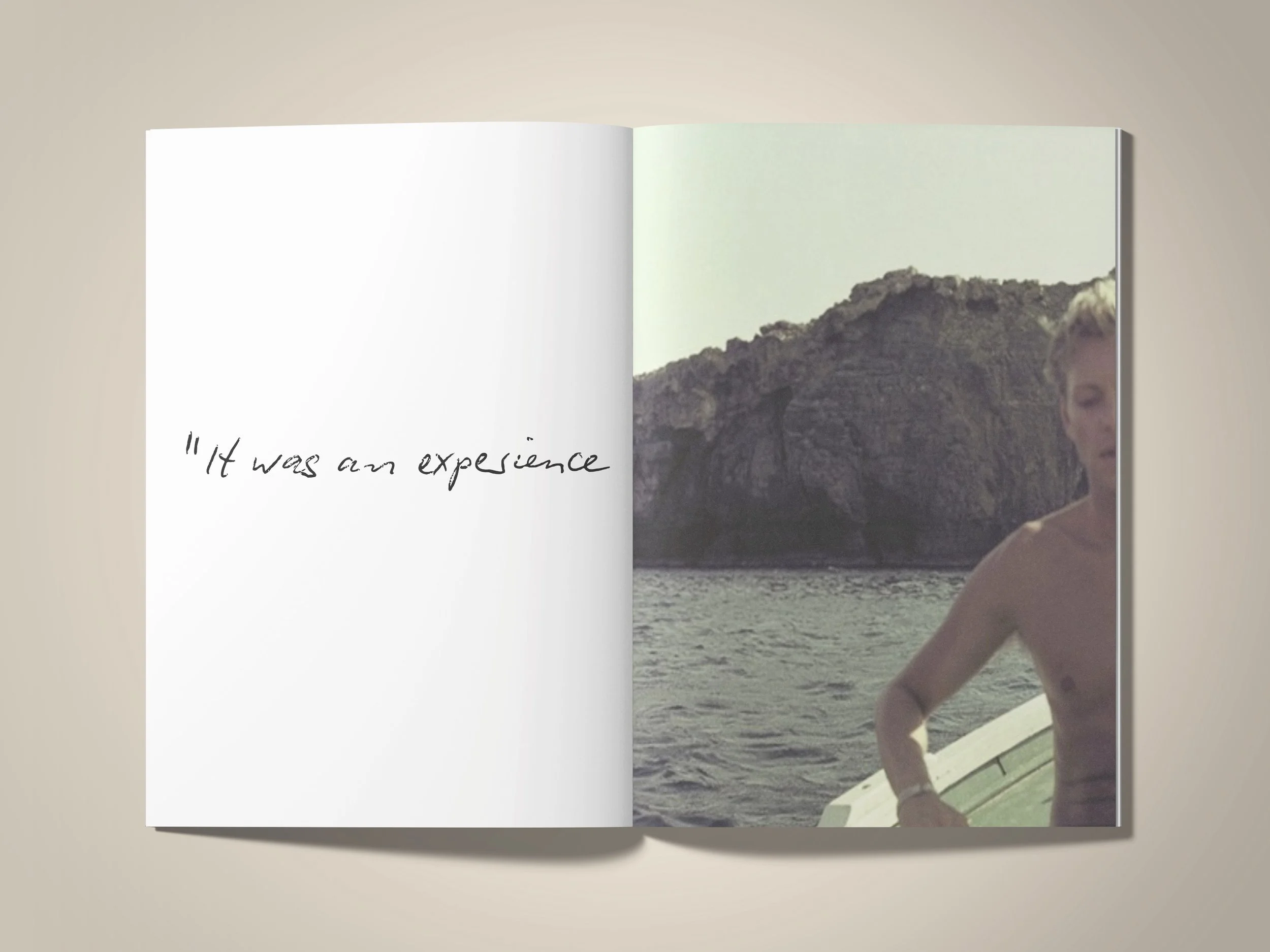
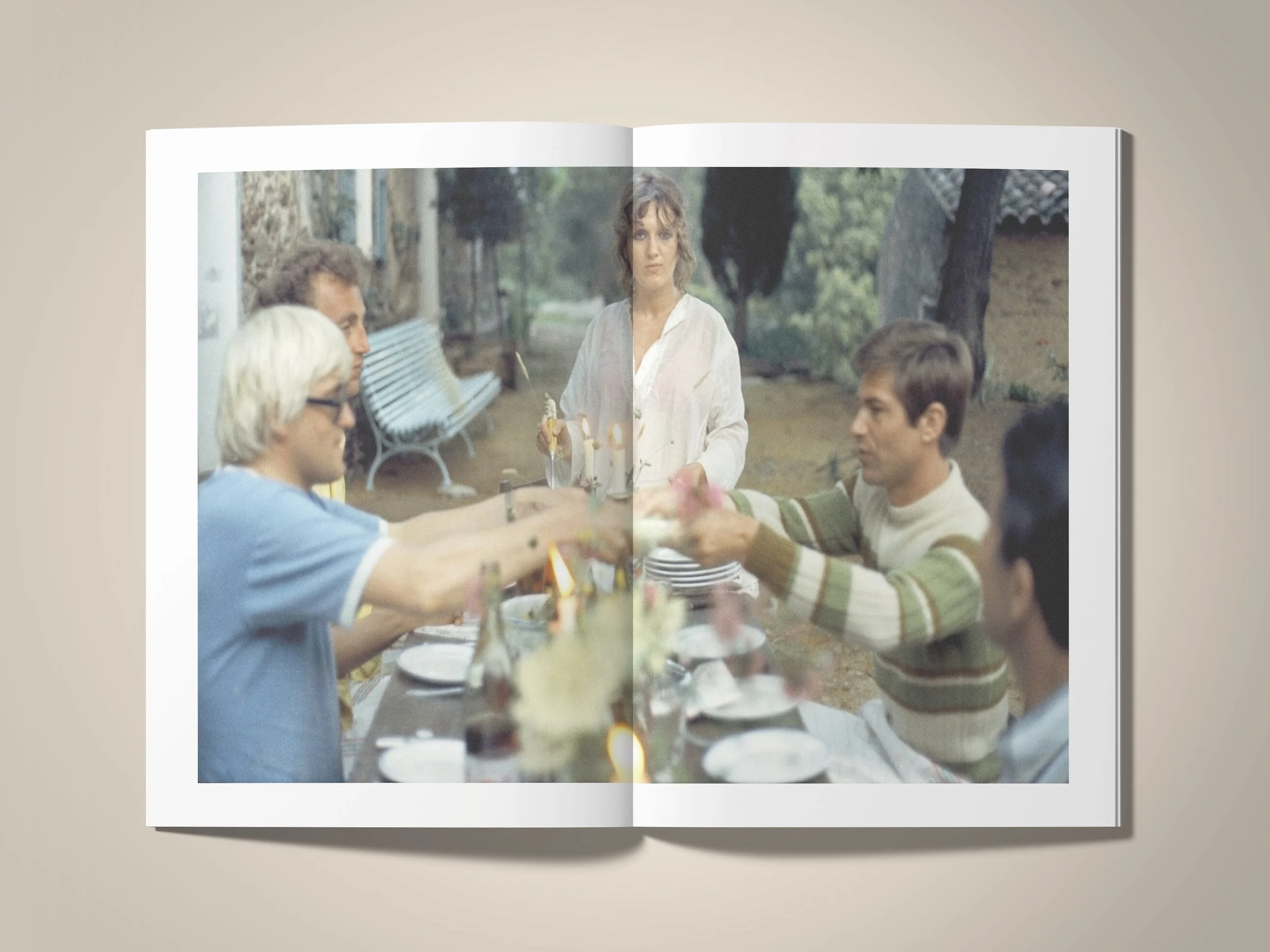
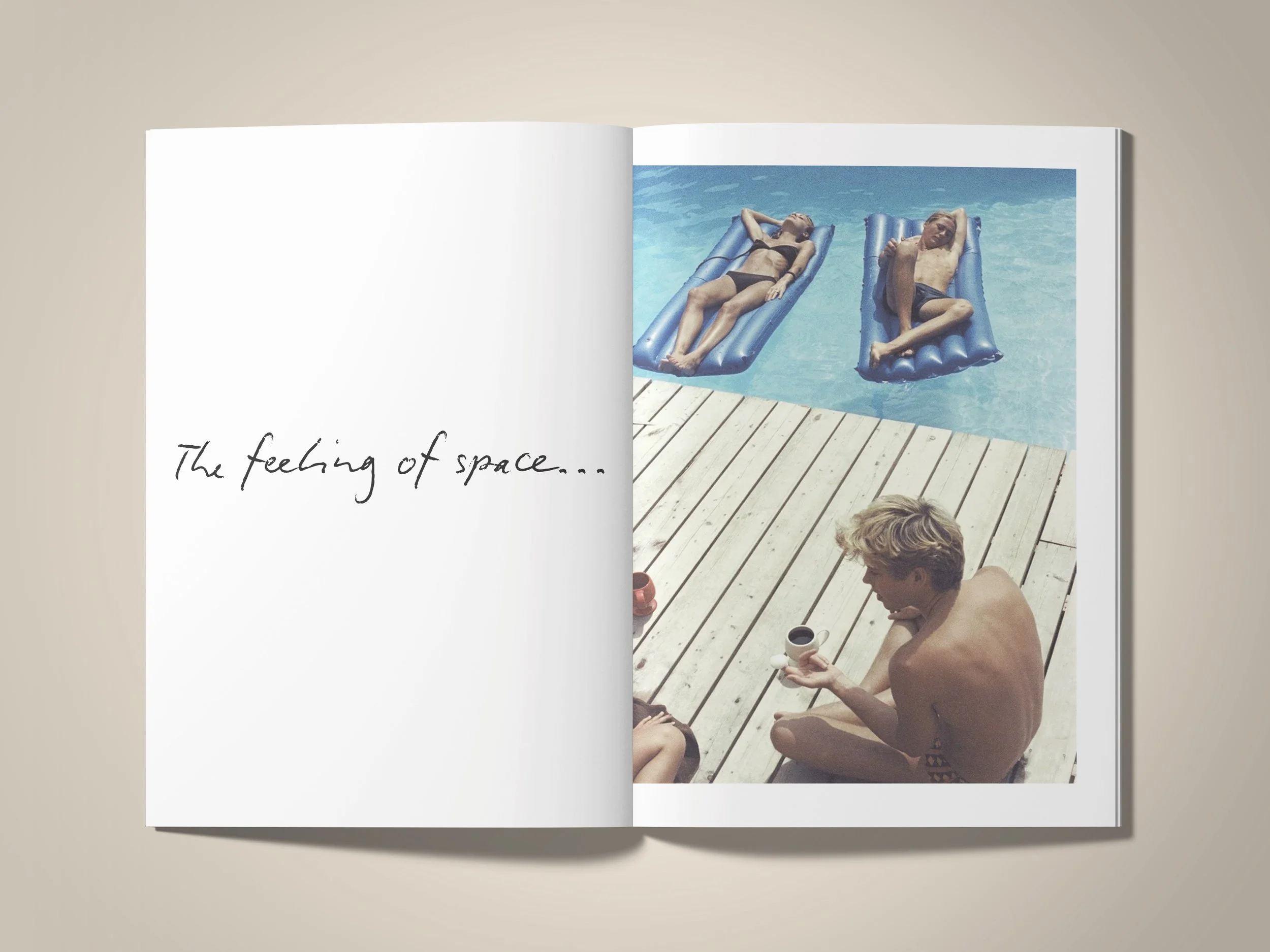
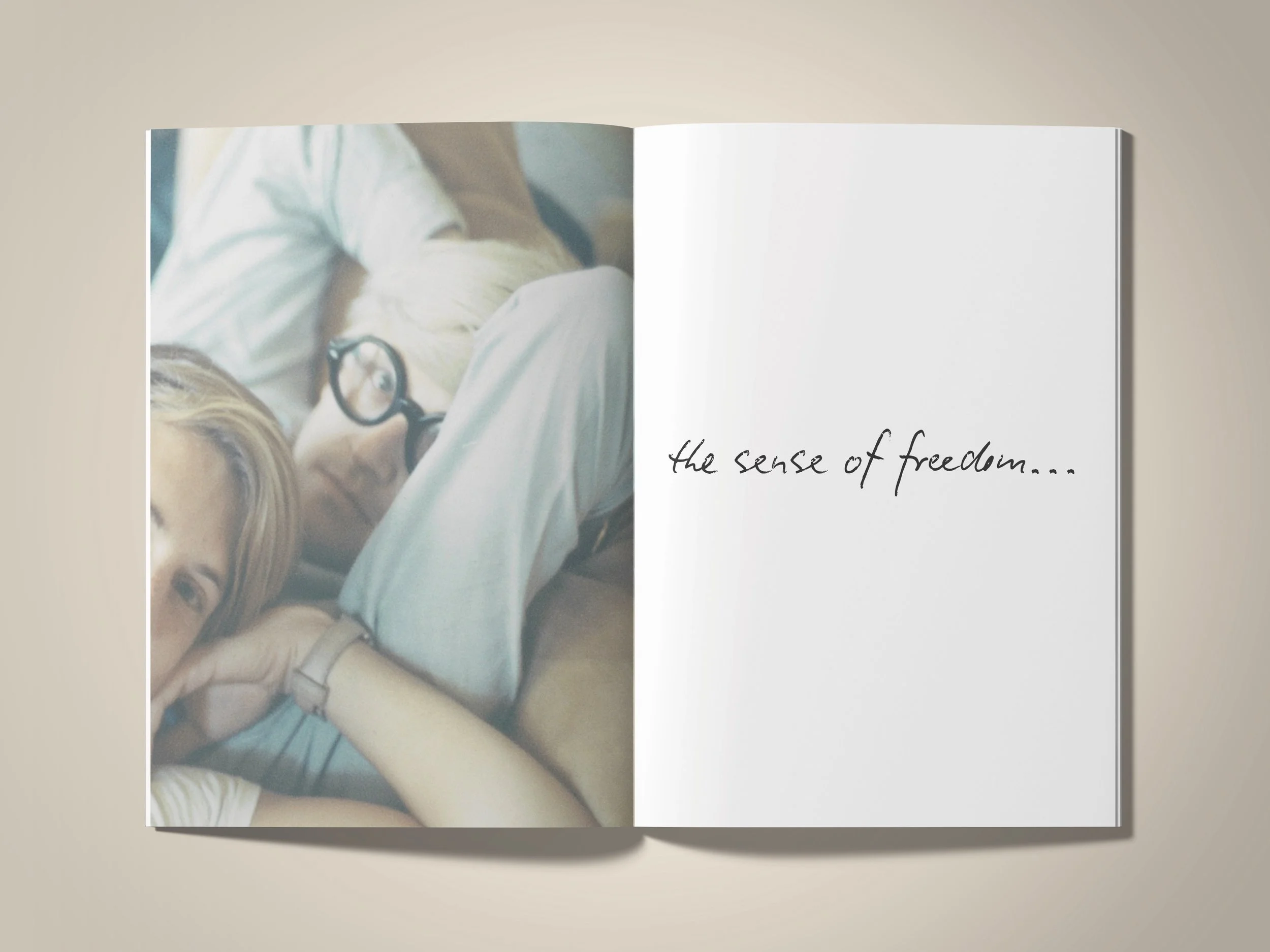
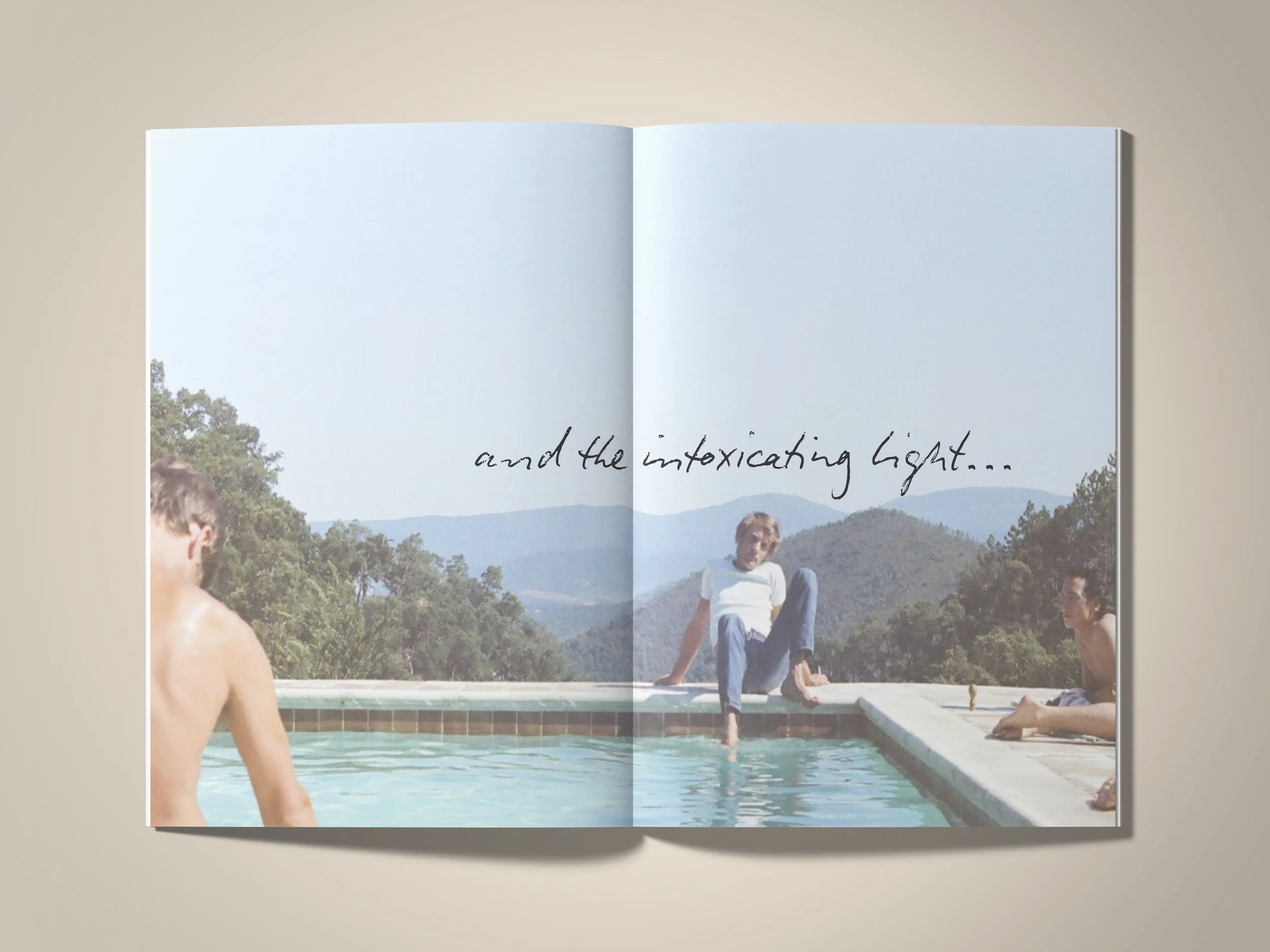
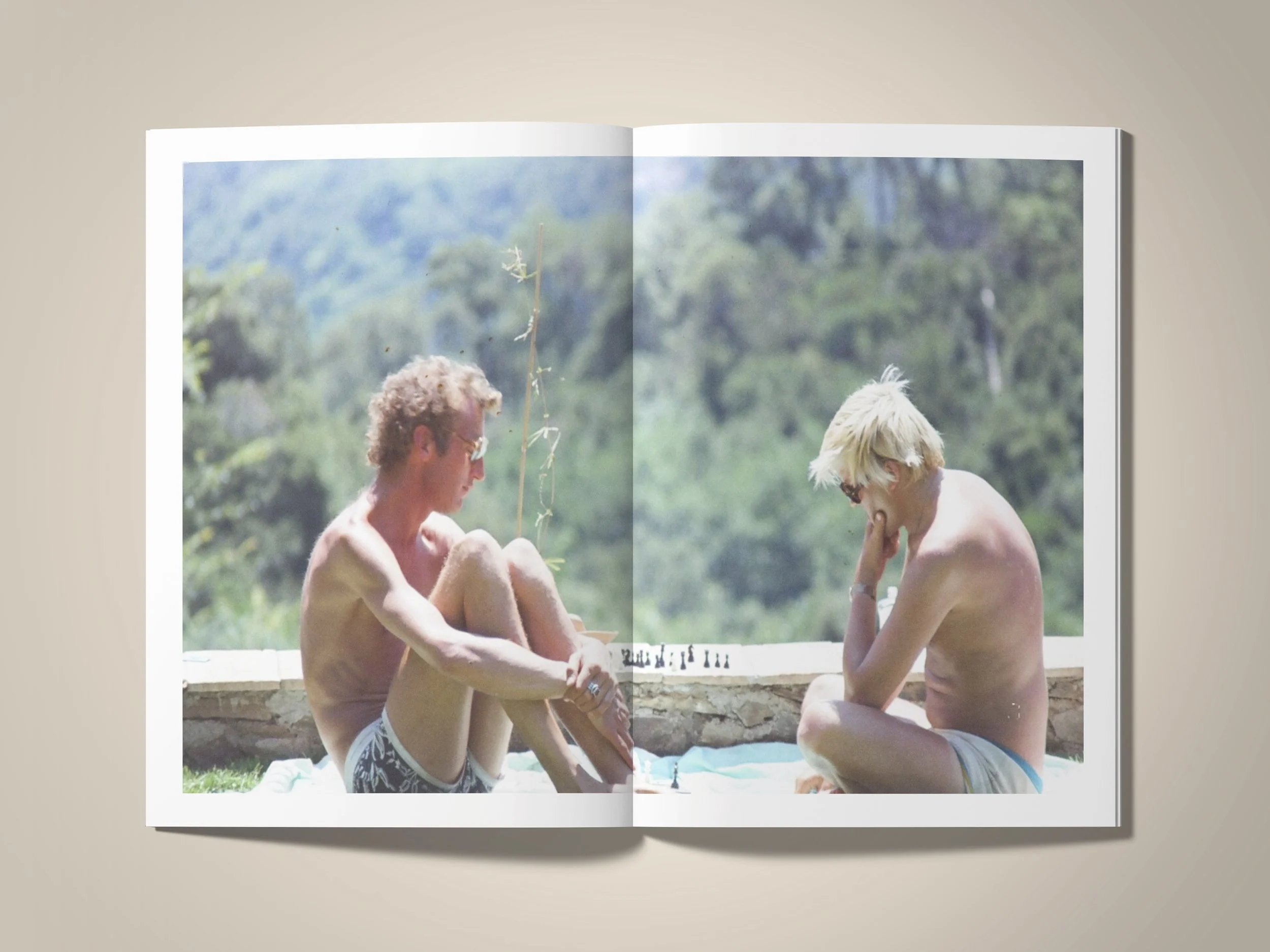
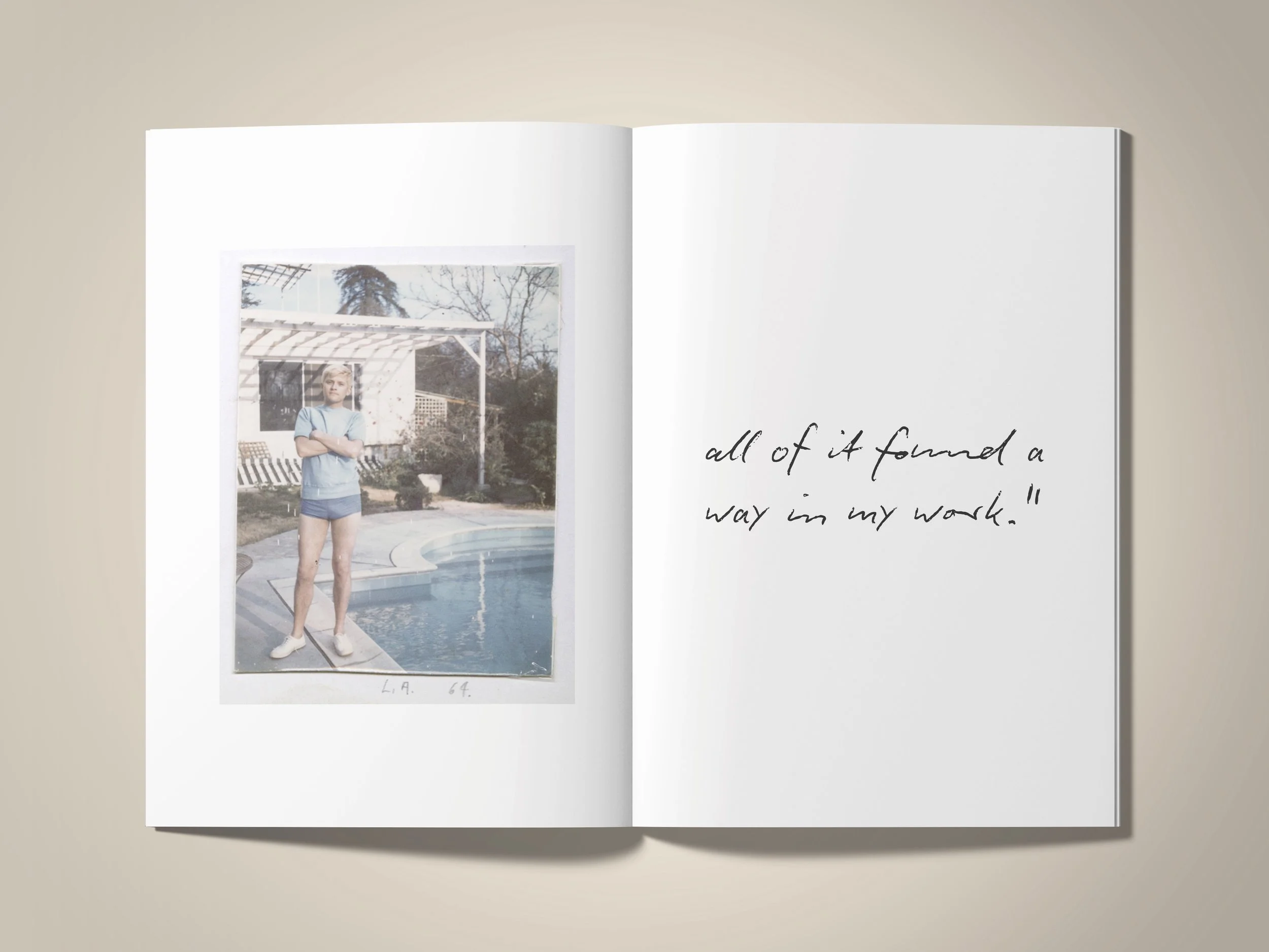
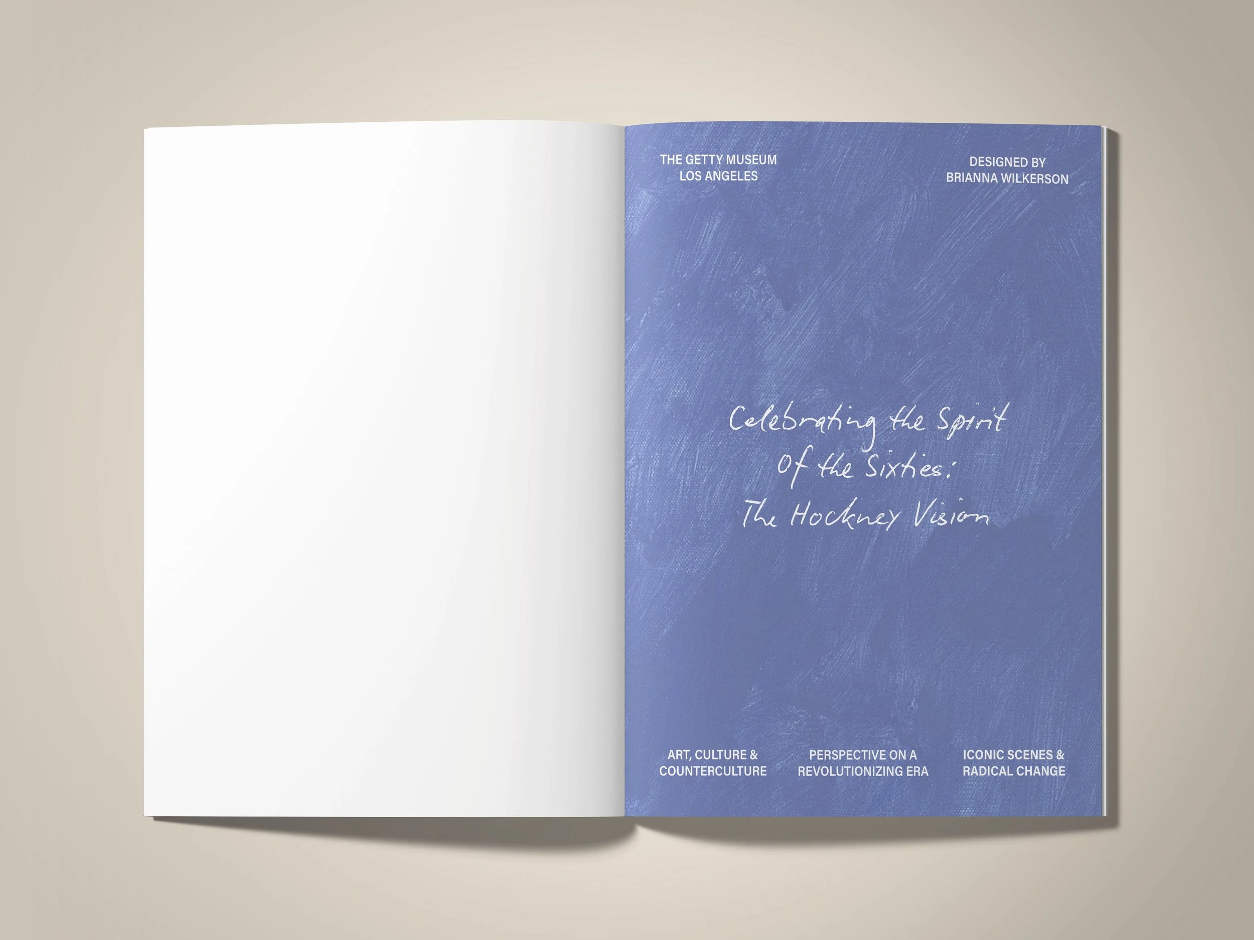
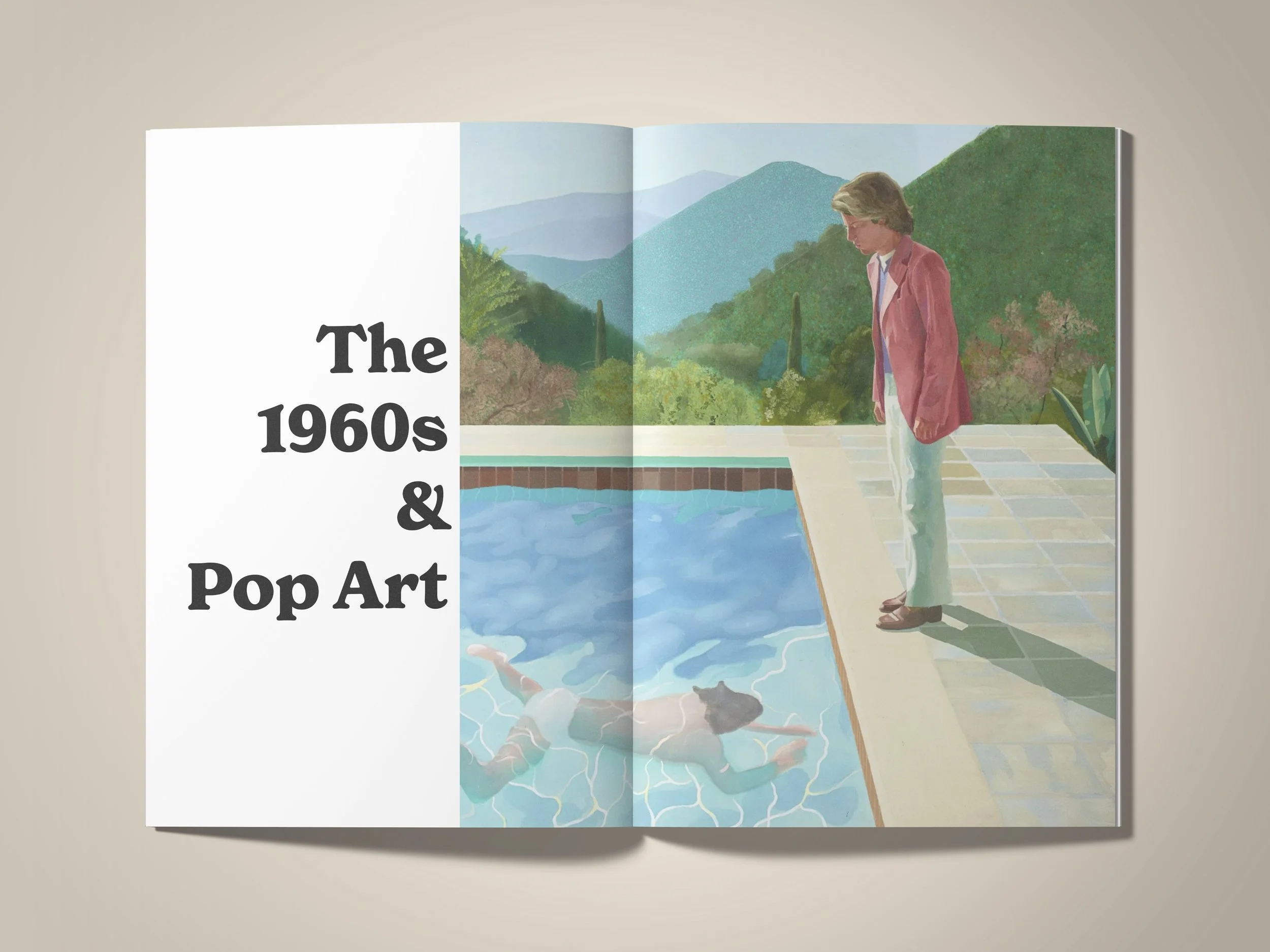
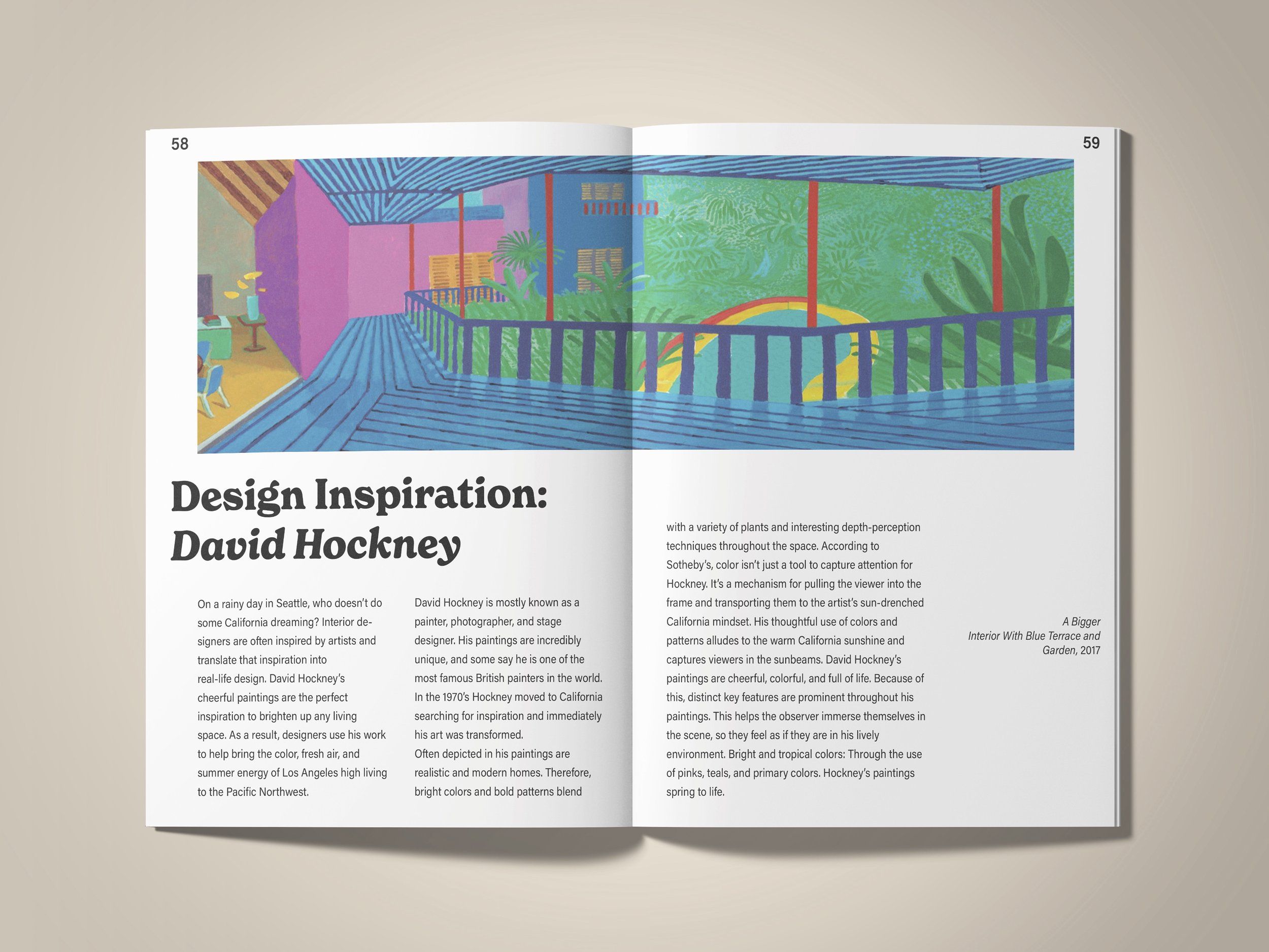
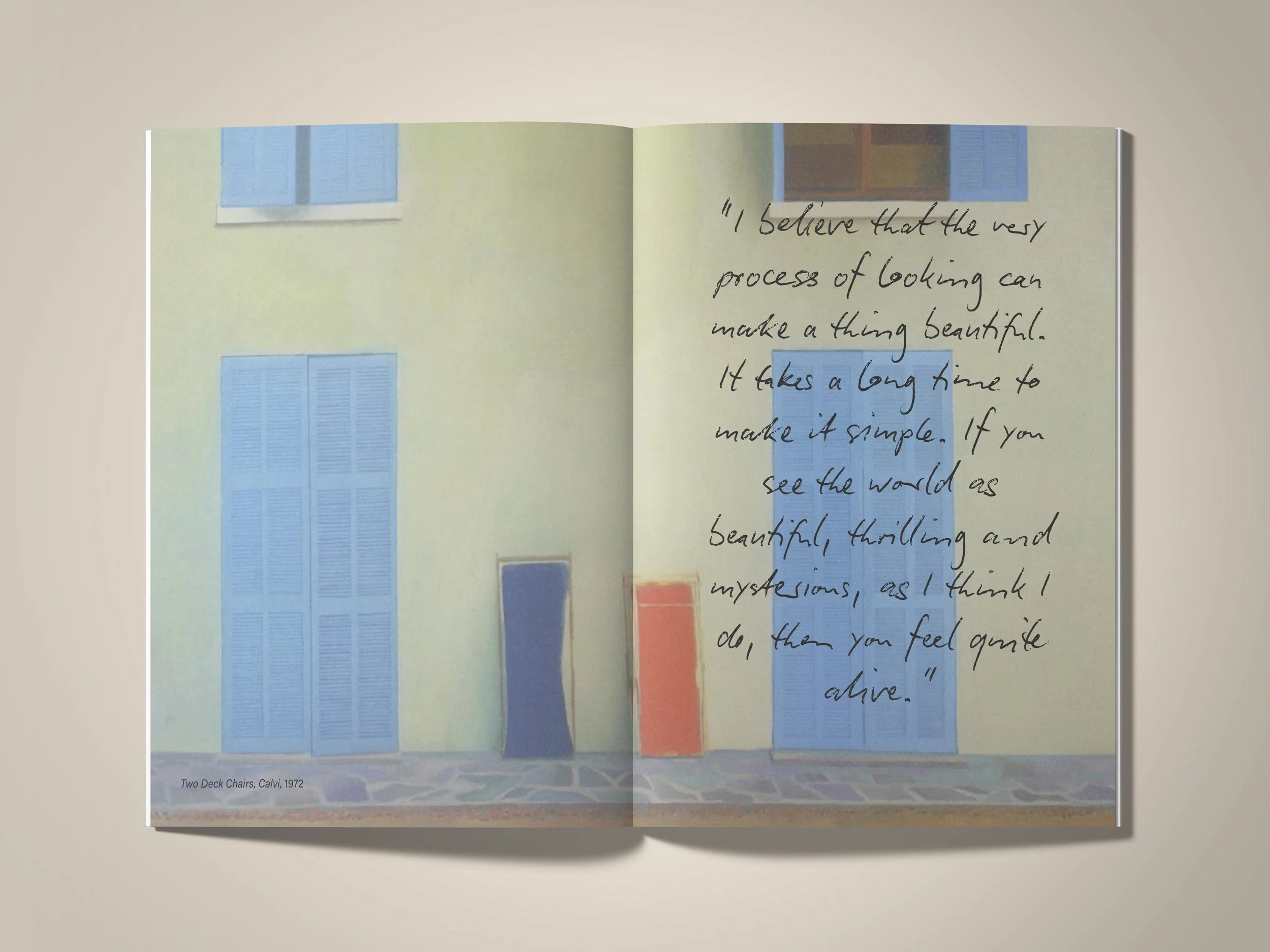
The book design for Celebrating the Spirit of the ‘60s: The Hockney Vision captures Hockney’s artistic essence and the cultural vibrancy of the era through bold typography, a vintage portrait, and dynamic composition. The stylized title reflects his playful approach to form, while the muted photographic tones contrast with the striking blue text, evoking a modern yet retro aesthetic.
The 75-page book features Hockney’s interior artworks, reinforcing his fascination with space and perspective, while the clean typography ensures clarity and engagement. The design merges nostalgia with contemporary appeal, making it a fitting tribute to Hockney’s influence on art and design.
*Included below are the book’s introduction, a few title pages, and some content pages!
8 in. x 10 in.
Adobe Illustrator & InDesign
Pulse Branding
Pulse is an energy drink brand that is committed to health and environmental sustainability. It doesn’t have artificial ingredients and uses natural fruit accents instead and provides sugar-free and professional combinations for health-conscious customers. The drinks give energy without extra calories and are in recyclable containers. With the combination of health benefits, natural fruits, and green packaging, Pulse stands out with great industry growth and leadership potential.
The Pulse energy drink designs use a sleek black can with bold neon accents to convey a modern, high-performance aesthetic that appeals to an active, trend-conscious audience. The blue variant, Arctic Surge, evokes a sense of cool refreshment and endurance, while the yellow variant, Citrus Volt, radiates electrifying citrus energy, reinforcing the idea of power and vitality. The minimalist yet futuristic typography, combined with the dynamic water splash imagery, enhances the perception of movement, hydration, and an adrenaline-fueled experience.
Adobe Illustrator & Photoshop
“To health-conscious individuals and environmentally aware consumers, Pulse is the natural energy drink that provides a clean, sustainable energy boost because it uses real fruit ingredients, offers sugar-free options, and is packaged in eco-friendly, recyclable materials.”
“To health-conscious individuals and environmentally aware consumers, Pulse is the natural energy drink that provides a clean, sustainable energy boost because it uses real fruit ingredients, offers sugar-free options, and is packaged in eco-friendly, recyclable materials.”
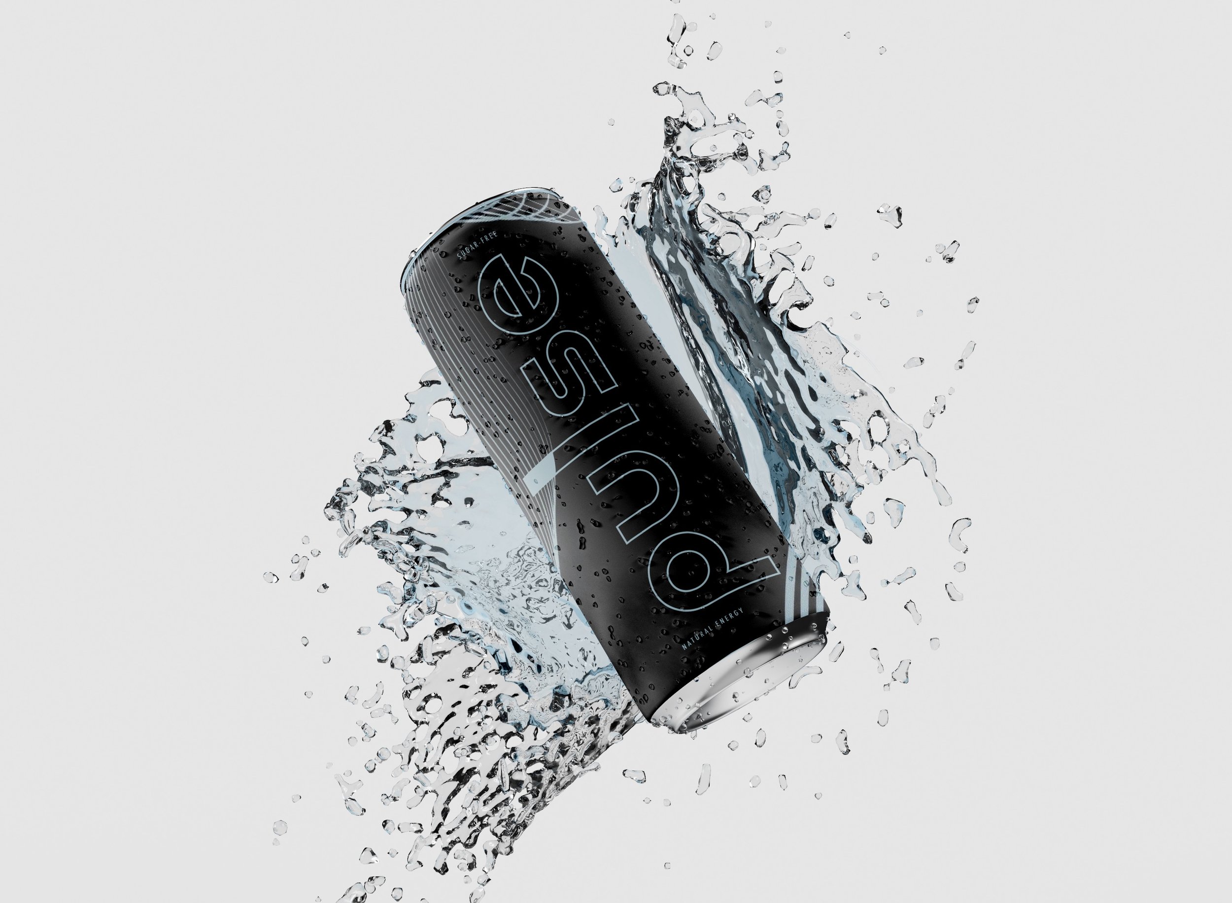
"Arctic Surge" Flavor
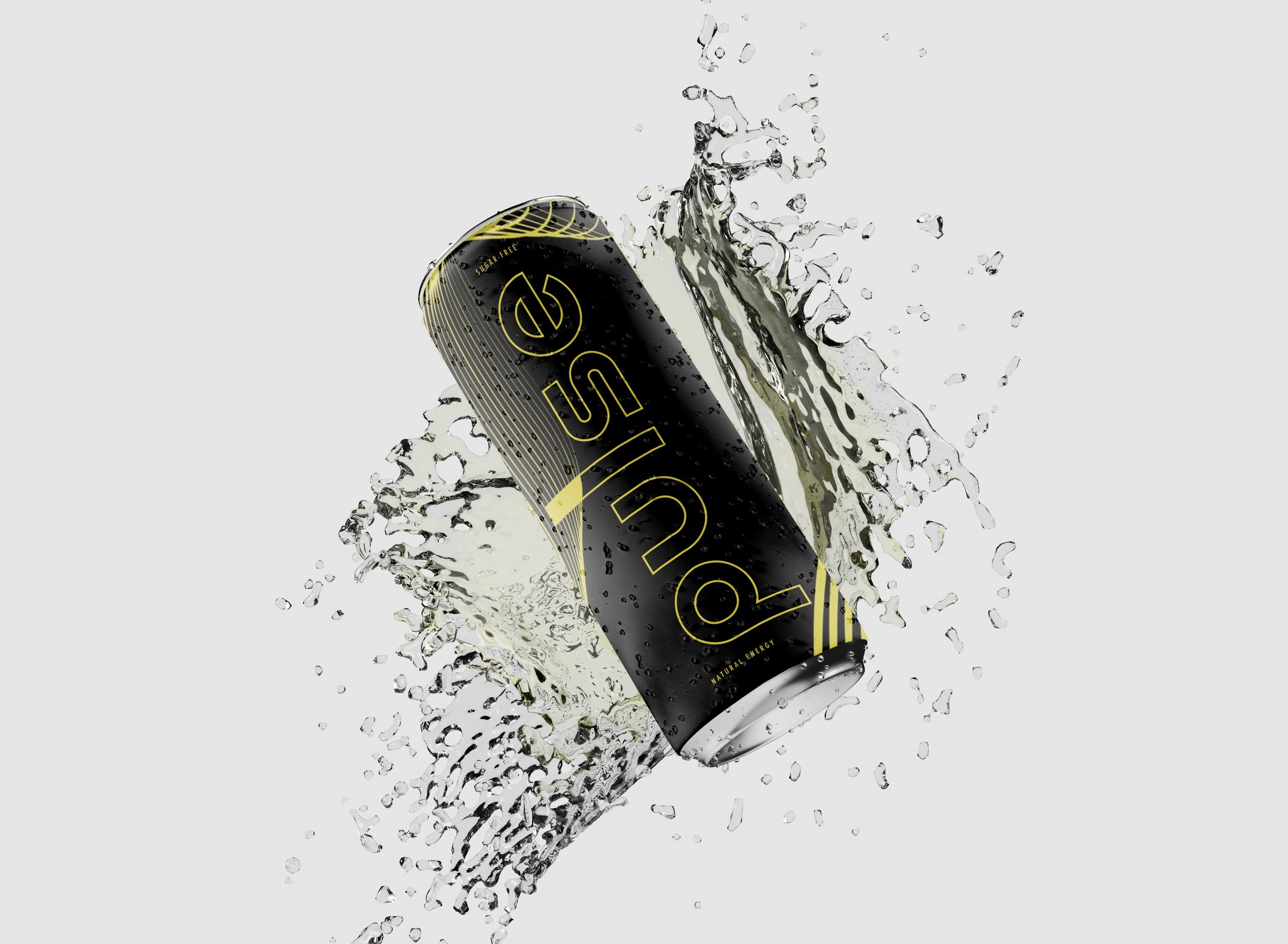
"Citrus Volt" Flavor
Lonely Ghost Launch
Creating a collage art piece with colored shapes and a tree photo inspired by A Time for Everything offers a visually compelling exploration of the passage’s themes and my personal struggle with the fear of wasting time. The tree symbolizes life’s cyclical nature, while the colored shapes reflect the diverse experiences outlined in Ecclesiastes 3:1-8, serving as a guiding framework through moments of anxiety. Through layering and abstraction, the collage captures the complexity of time, encouraging reflection on life’s rhythm and the significance of each season.
Expanding this concept into a sweatshirt design and social media launch video aligns with the ethos of Lonely Ghost, a brand that fosters meaningful conversations through its products. The tree remains central, representing the passage of time, while the colored shapes stylistically express my challenges in adapting to life’s transitions and how this passage offers reassurance. A video of laundry swaying in the breeze visually reinforces the ebb and flow of life’s seasons, and when paired with the sweatshirt campaign, it conveys a message of embracing change and finding peace in every moment, resonating with both my journey and those who connect with symbolic storytelling.
Adobe Illustrator, InDesign, Photoshop & Premiere Pro
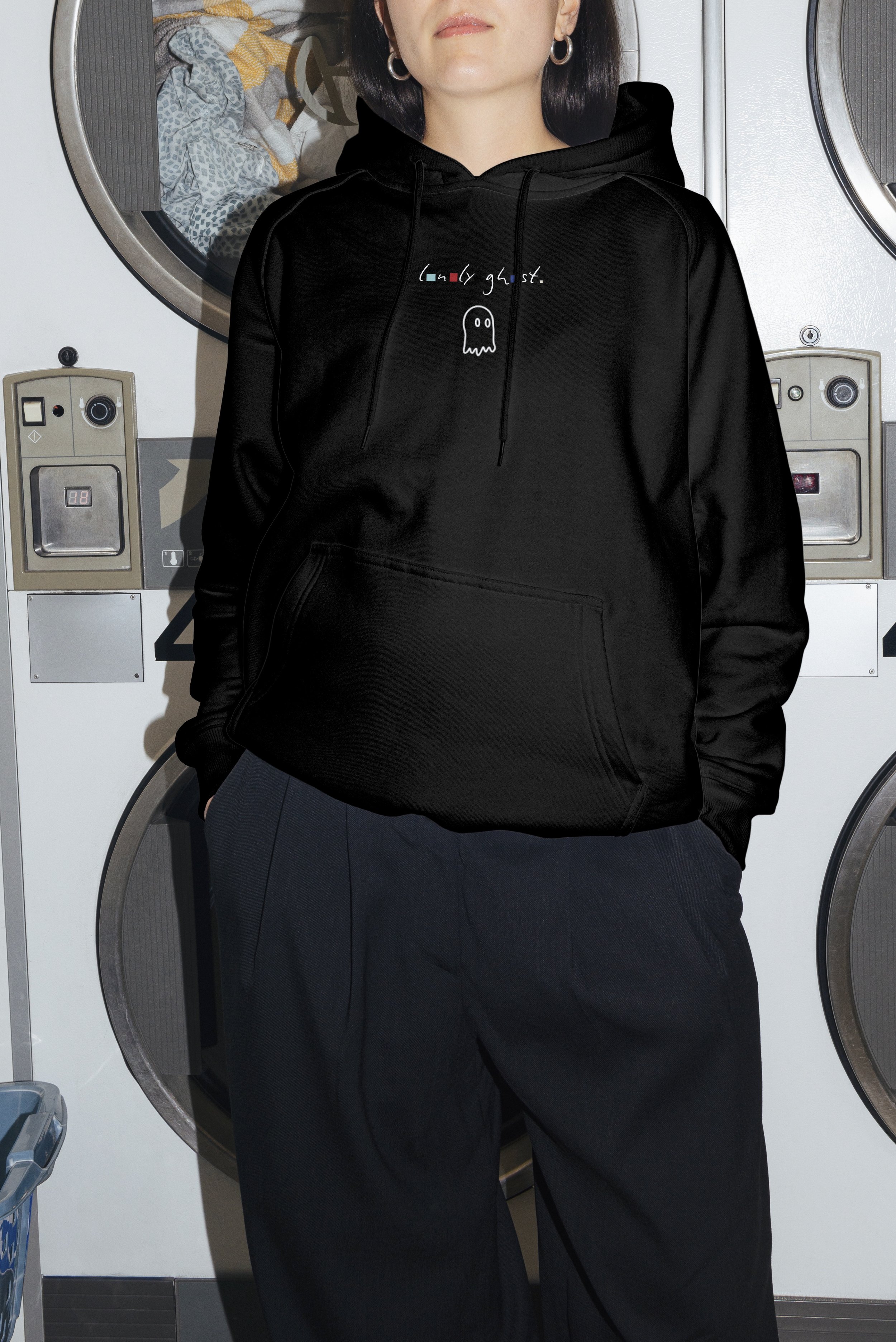
Front Design
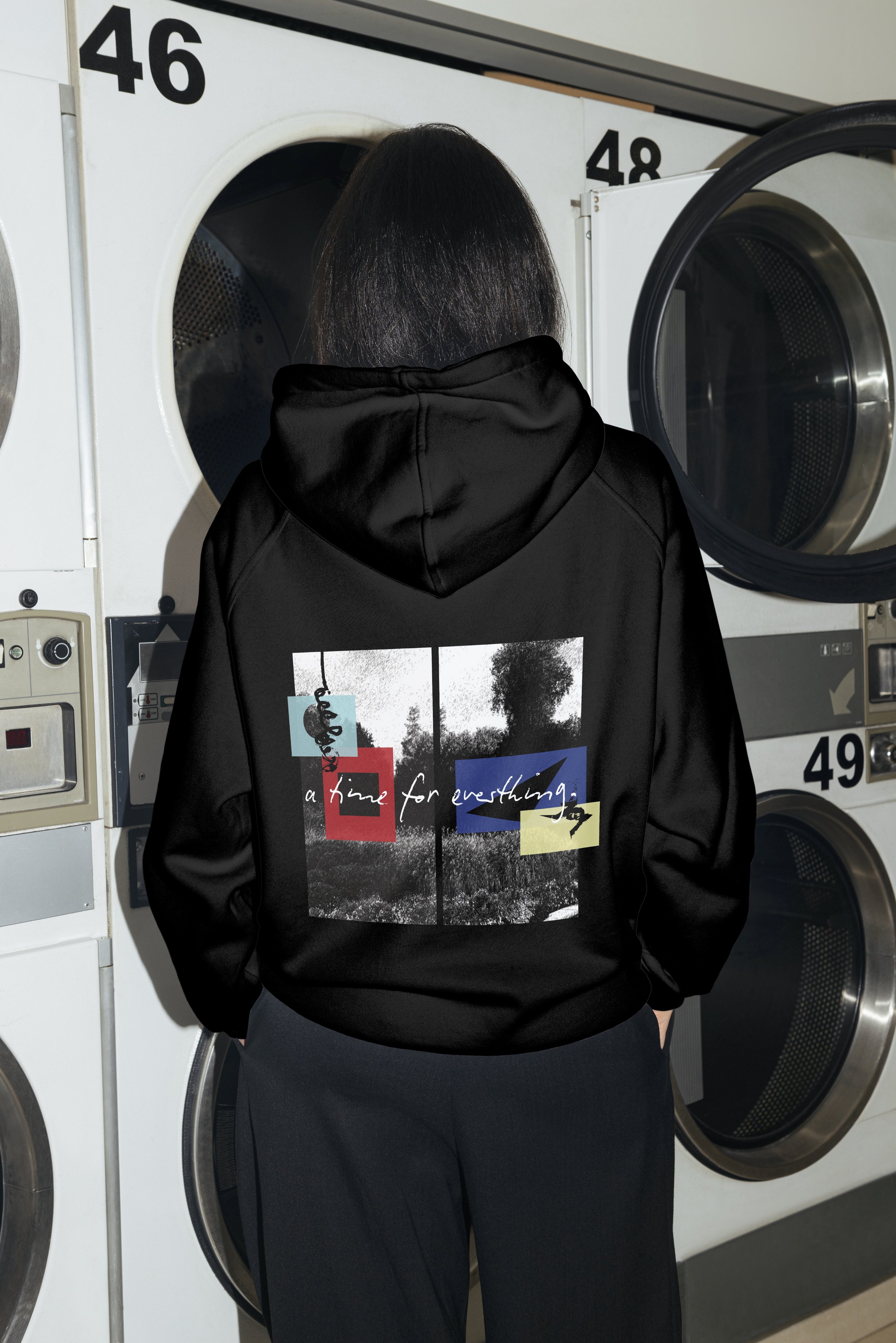
Back Design
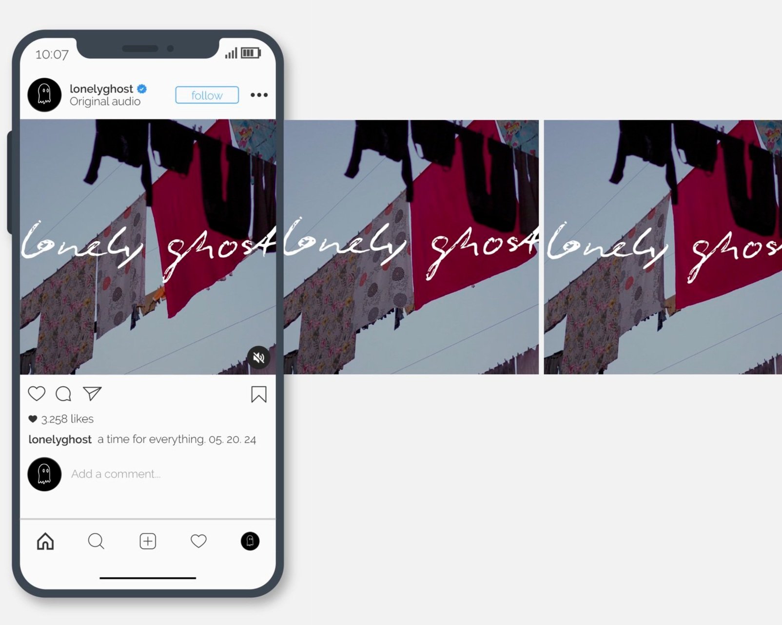
Social Media Carousel
Visual Semantics
David Hockney is a multi-media artist who utilizes various techniques and whose art spans across decades. However, he is most commonly known as a prominent figure of the pop art movement, depicting everyday scenes, usually landscape art, with his vibrant color palette and distinct use of space and perspective. In my final design, I wanted to relay the feeling of Hockney’s work and his goal of capturing the spirit of the 1960s with those attributes in mind. The 1960s curated this new found freedom of culture, so I played on that with making a design that makes people’s eyes move throughout the page and has a free-form feeling while keeping basic geometric shapes.
With the sole use of rectangular and circular objects, I wanted my piece to be more abstract rather than orderly to accentuate Hockney’s ability to transform simple displays into bold, fanatical artworks. The splashes of blue allude to a lot of Hockney’s paintings, illustrating pools of water, as well as highlighting attributes of pop art. The orange and blue color palette exhibits the vibrancy and fluid nature of the period, along with Hockney’s typical depiction of sunny days. Ultimately, the composition of my design leans into way letters, shapes, and angles all interact with each other to further explore spatial relationships, just as David Hockney’s work reveals.
Adobe Illustrator & InDesign
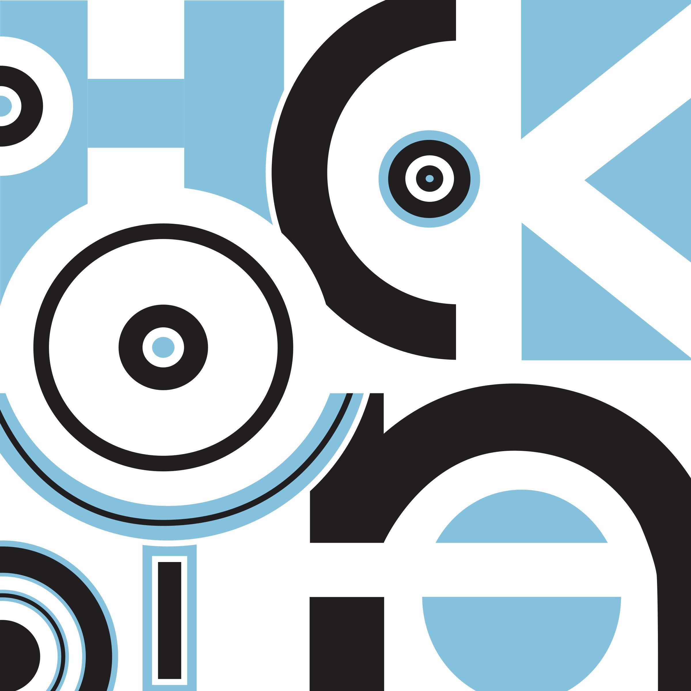
Initial Design for "Hockney"
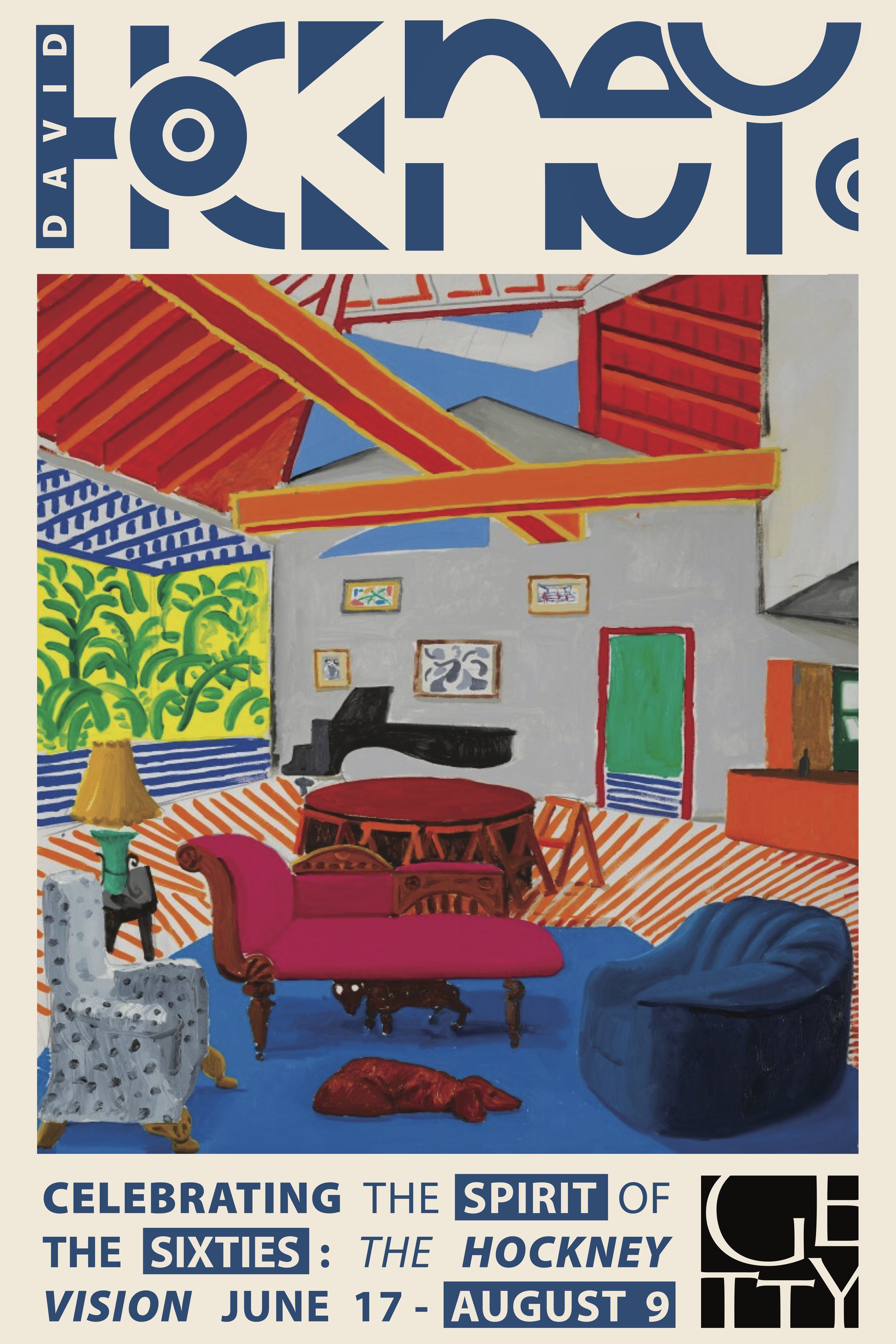
Museum Poster
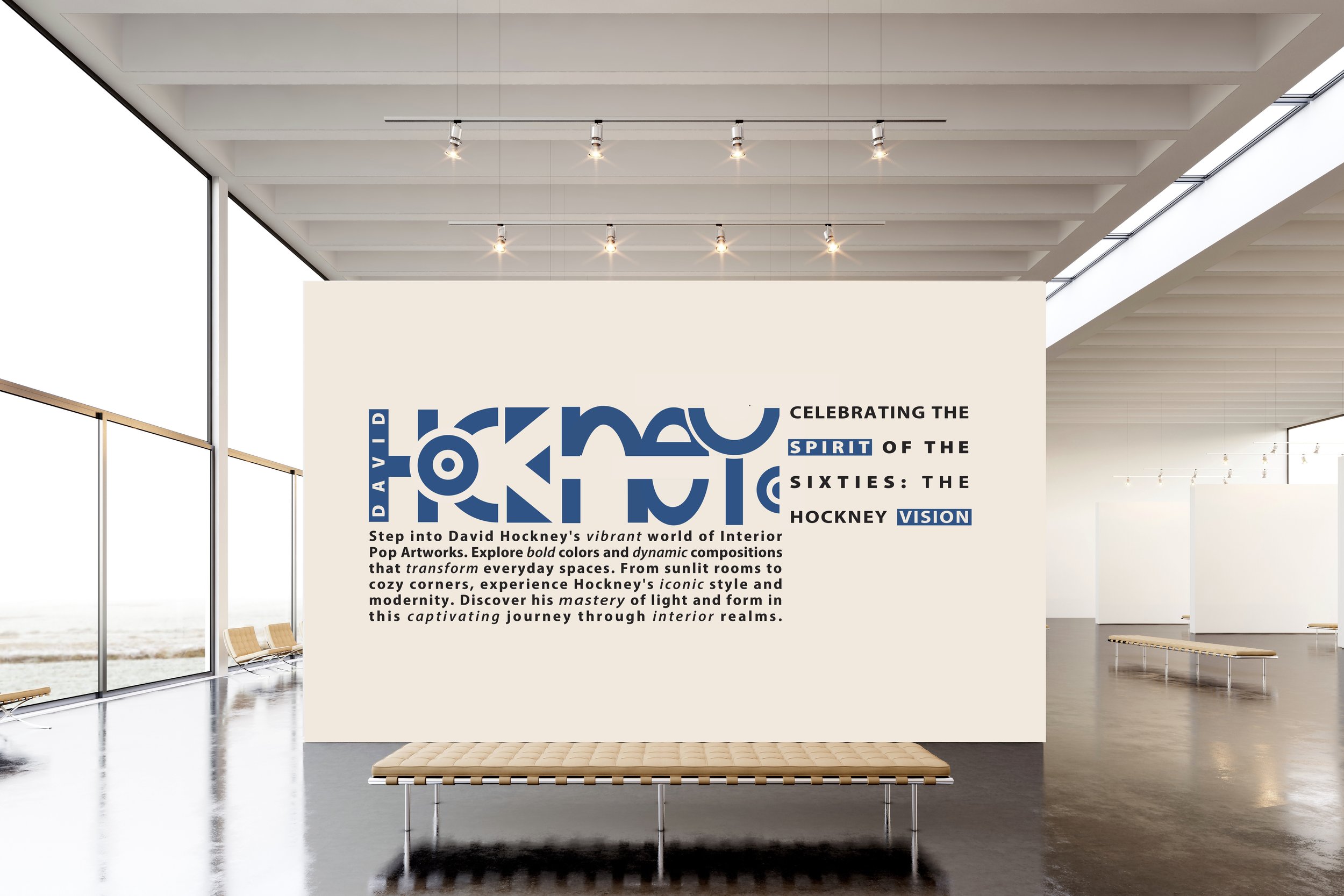
Museum Wall
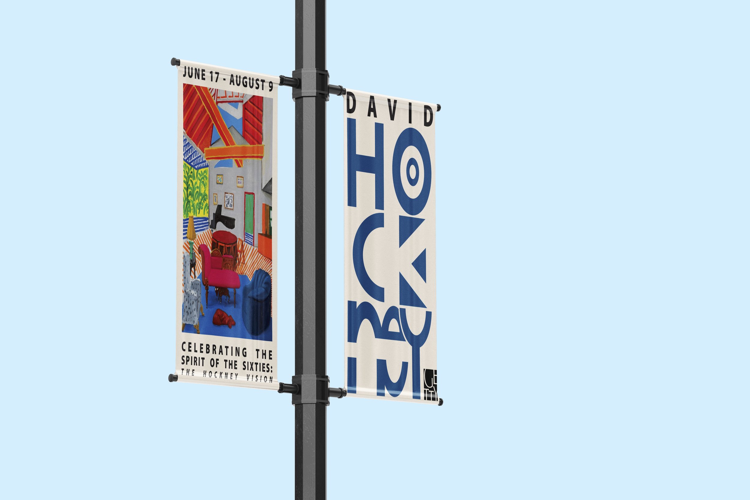
Street Banner for Exhibition

